No products in the cart.
Return To ShopKat von D Sanctuary, Hawkwind and Crucifix Compared
I took a million pictures with my heavy-duty DLSR camera but in the end couldn’t get the colours to look accurate in any of them, so instead I offer you iPhone snaps ;DI got a couple of the new neutral Kat von D shades while in San Francisco and wanted to do a comparison with other similar shades in my collection. Beiges and browns are notoriously hard to get to look correct in photos, but I think I did a decent job with these. The pictures are taken in artificial light. From top to bottom: Make-Up Monsters Wolfsbane, Kat von D Sanctuary, Kat von D Hawkwind and Kat von D Lolita.Sanctuary works excellent on my pale skin with yellow undertones. It is warmer and more red than Wolfsbane, but still more towards grey than Hawkwind or Lolita. Wolfsbane and Sanctuary look much more similar in the tube than on skin. Hawkwind and Lolita are very close to each other. I’d say Hawkwind is slightly darker and redder, but the difference is very small on my lips.
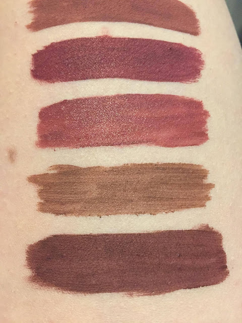
 Top to bottom: (Lolita peeking on top) Sephora Cream Lip Stain number 24 Burnt Sienna,Black Moon Cosmetics Wrath (this one has a satin finish, that’s why it’s shinier than the rest),Nyx Lip Lingerie 10 Teddy and Kat von D Crucifix.
Crucifix seems to be unique in my collection. The rest of my dark brownish tones are much more red than it. You can see that the Nyx Lip Lingerie is a lot thinner in consistency than the others, and Black Moon Cosmetics lippies are satin, not completely matte. The Sephora Cream Lip Stain looked like it could be a match to Crucifix in the tube, but on skin it’s very different.
I really like all the shades I bough: Hawkwind, Sanctuary and Crucifix. They are very different from each other but each one is usable and the formula is simply awesome. Hawkwind especially is a very natural and easy shade to wear, on me it’s one of those my-lip-but-better shades. Easy to apply, does not need major touching up, and wonderful shades. What more could you ask for?

